Showing posts with label Visual Design - Steve Brown. Show all posts

Thursday, 26 March 2015

Term 2: Photoshop Session 4: Lava Design

This week's session we were taught a few fundamentals of art, specifically the making something appear hot. In art and real life a hot object is brightest at its core/the source of the heat, in terms of lava the hottest part is beneath the rapidly cooling surface where it glows almost to the point of being white in appearance.


With this in mind we began to paint with simple Photoshop colours to produce the appearance of heat, using an image of lava itself as reference. I also took a piece of the reference image and overlaid it on my lava sketch to add some detail, although ti didn't come out as well as I had hoped.


We were then shown how to produce more convincing lava, by applying the inner glow and outer glow effects in the fx tab in Photoshop our sketches had very bright cores and dim outer glows similar to how it is in reality where it's brightest at the source of the heat and dimmer further away from that source.


Finally we were tasked with taking a stock photo of a sculpture and making a lava creature. To do this I immediately added a black background to contrast the bright lava I would be adding and also added the inner glow and outer glow effects to my main layers to start sketching.

It definitely could be improved, the additions I made were very basic and I wasn't too happy with the result however this session helped improve my skill and allowed me to go on and create one of my favourite pieces with this sessions homework, which was to design our own laval creature.

Term 2: Photoshop Session 6: Street Texture

Today's session we were taught a new way to texture objects in Maya through a software piece called DirectX11. DirectX11 allowed us to see a real-time preview of how the textures would appear in the game through Maya complete with shadows.


I began by texturing the barrel, for this I wanted to make it appear old, beaten and very rustic. So for the wood I used the plain wood grain texture we were supplied with and changed the layer style to linear burn which gave me the appearance of the old burnt wood, also distinguishing it from the image I had used for the texture. For the metal straps I layered 2 textures on top of each other and set the layer style to Overlay. To add extra detail we shown how to make simple metal bolts/screws and make them appear 3D through the use of the gradient tool. Making a circle with the Marquee tool we used the gradient tool to create a grey colour that would fade into black to indicate a shadow.


Next I applied a few basic textures to the pavement and wall, apart from that I altered the metal strips on the barrel to give them the appearance of water damage.


For the pavement I overlaid a black and white texture which only represented spots of colour (black and white) as if someone had thrown paint vigorously off a brush. I like the effect this produced as it started to produce this scene of a run down street that is poorly managed and is disease ridden.


Finally I applied a similar texture to the wall as I did for the pavement and set the layer to Overlay. Again I like the effect I produced by making the walls look stained with or by who knows what, fire damage, rain water or mould. Overall I enjoyed my outcome in this session, there are areas to improve on however since I am still a novice when it comes to texturing as the unfinished boards and pipe show, but that was down to lack of time to finish in the session.

Tuesday, 17 March 2015

Term 2: Photoshop Session 7: Anthropomorphic Design


This week's session was based around Anthropomorphic creatures, the study of animals with human qualities. We were asked to design an athropomorphic creature that was based on a frog, so I began by creating myself a mood board and by looking at the two things I considered key for the frog design, the hands and eyes, I sketched out a few designs for practise and inspiration.


Here is my design which I spent 2 hours on. He is characterized as someone who is poor, homeless and has poor living conditions. I like what I have made here but the design is lacking a bit below the waist, the torso and above are the best parts of the sketch. I tried to implement some shading as that is an area I need to improve on but it didn't come out as well as it could have. My favourite part of the sketch however is the eye which I think is a significant factor in identifying this design as a frog.


Wednesday, 4 March 2015

Term 2: Photoshop Session 2: Pixel Art


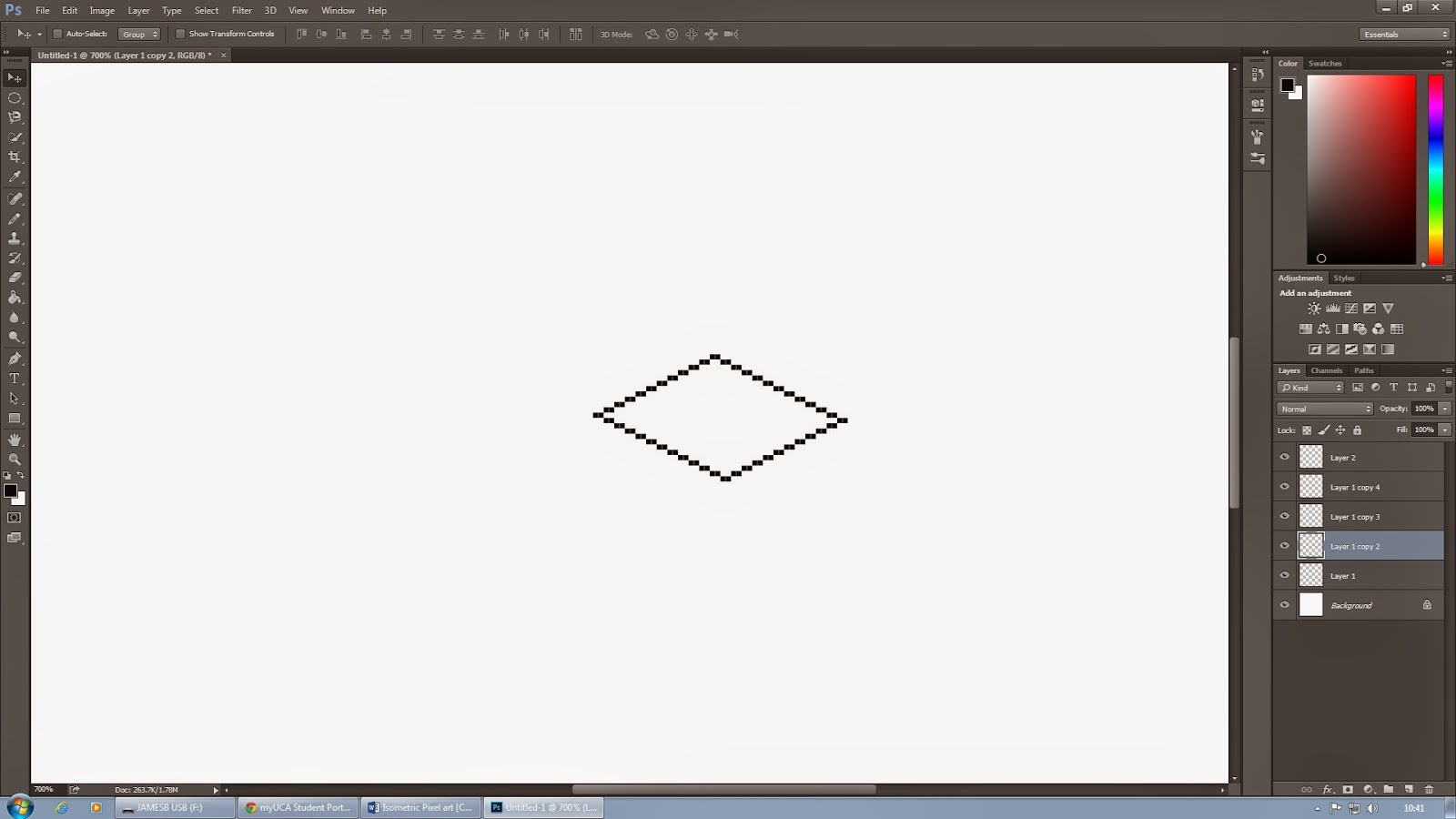
For today's session we were taught how to produce Pixel art and the techniques required to produce it in Photoshop.


The size of our canvas was 300x300 pixels. this is because pixel art when loaded onto the internet have incredibly small file sizes so me must work in smaller scales. To start we drew a diagonal line of pixels (with the brush size set to a single pixel and anti-aliasing turned off) 2 pixels across and diagonally up 1 until we had made eleven 2 pixel pieces to create the illusion of line. We then duplicated the layer and rotated horizontally and vertically to create the 4 other lines to form a square.


Next we grouped the separate layers to together, duplicated the group and moved the duplicated square vertically and added in 3 lines for the corners to form a cube.


Next, using a different colour, we drew a circle in the square space we made so as to make a cylinder, this space would be the base of the Cylinder itself.


Like before with the cube we duplicated the layer with the new cylinder base and moved it up. After which we merged the layers and, using shift, created the cylinder's walls.


We were then tasked with making a fire hydrant replica of one from a screenshot we had been provided. To do this I placed the image into a new layer and dropped the opacity, this made it transparent and allowed me to work on top of the image so that I could draw the outlines appropriately.


Once drawn I began to paint the hydrant even matching the sample hydrant pixel for pixel, although I didn't manage to finish it during the lesson.

Term 2: Lava H/w Project Session 4

For this assignment we were tasked with making a Lava based creature concept, so to start as always I did research into what other artists came up with. A few things to note when designing a lava based creature which I was taught in lesson, and evidenced in other work, is that the hottest part of the lava or a fire is the centre where on the spectrum between Red and White, white would be in the core.


I liked the idea of my design being shrouded by the heat and smoke and that I would expand on it more as it is an idea that can be seen in other designs but is used more for effect rather than design.


I started off by designing a creature that would "pull" itself out of the lava, cooling the lava and hardening it around itself as it does to create a shell, but it would also be able to melt back into liquid lava to manipulate objects around it. Its main form of movement would be to seep back into its laval base and travel through the lava being able to bring itself back up at any point.
As a sketch it's not one of my best but I very much like the concept.


This I designed to be almost totally shrouded by the smoke it produced, I also wanted to make something more humanoid to give it a sense of intelligence. As a sketch I like this one, I used charcoal for the smoke mixed with pencil markings so as to produce this fluffy, lightweight feel to the sketch. I used the main muscles of the human chest and neck as a basis for the visible portions of his body, using a red pen marker and pencil sketches to create the feeling of the chest erupting and expanding with heat ad lava.


Again shrouded but not through its own creation, instead I used the environment/atmosphere to create the shroud, using charcoal and the red pen to emulate smoke and embers in the atmosphere. This design was influenced by laval golems and creatures that appear to hard a hard surface skin/texture but underneath are bubbling cauldrons of lava and heat, hence the use of red pen in the joints and cracks.


Finally this is my final design where I was able to use the painting of Photoshop to truly express the heat of the creature. the body is not visible but the silhouette is shown through the orange glow given off from the creatures back which houses an open pool of lava, which in turn gives off the glow and smoke (which would also be an orange hue due to the light from the lava). The only things I wanted to show through the creature was its core (the chest), mouth and eyes: all of which house an excessive amount of lava, as such I used lighter yellows for the colour but in hindsight I should have used lighter colours moving up towards white to emphasise the heat. However I do like the painting I did to show the smoke/heat given off by the mouth and chest, for which I used Filter > Other > Maximum.
Overall I am pleased with my final piece but I realise that there is room to improve and areas that I can improve on in this design that would help make the figure a bit more striking such as making the orange glow in the background a bit more vibrant to emphasis the silhouette.


Tuesday, 3 March 2015

Term 2: Photoshop Session 5: Layer Texturing

Today's session we are practicing the technique of  applying texture to a model surface through the use of Overlay layers in Photoshop, the Skew tool and Warp tool to follow the perspective of the model. The model we were given to texture is featured below.


This is the model after I had applied the texture, using a total of 4 layers for the base, flat face, barrel and barrel face.


We then used the Dodge tool to apply highlights to the the metallic surface, creating the illusion of a sheen. I only applied this to the top right hand face and the top half of the barrel, where the light is most harsh.


We then moved on to texturing an organic creature, specifically a vampire.


I decided to make him decayed which I thought would be symbiotic with the vampire itself as it is an undead creature. Before the detail of the decay I added a base skin tone, I used a pale pink skin tone as it represents the blood the vampire feeds off taken into his body but he cannot process it so it fills the space inside it's body turning the skin a hue of red/pink/


With the skin tone in place I added the decayed appearance I was going for. For it I used an overlay layer of a rough, rustic metal picture to create the flayed skin appearance.


I then Overlayed a skin texture to create the appearance of blood permeating through the skin, like an undead he cannot process the blood he consumes so it fills his body, going no-where.


To add to the idea of this Vampire being truly undead, I used a second Overlay layer of a skin texture to create a more rotting appearance. 


This is the final piece of the session. Due to the contrast in temperature between the cold skin and warm blood, the escaping heat produces a smoke/steam effect emanating from the body. To create this I used a low opacity brush with a white colour pallet and lightly brushed the streaks of smoke and applied a Filter > Other > Maximum to create the hollow transparent appearance. I also added colour to the claws, again with the decay idea, I chose a yellow hue; I also overlayed a small portion of mold from a stock image onto the mouth as in death the mouth turns blue and swells due to lack of oxygen.


Term 2: Steampunk H/w Project Session 5

This week's project set us the task of designing anything of our choosing but was Steampunk in design. As usual I created a mood board to provide myself with a few reference images to draw inspiration from.


I knew from the get go that I wanted this well dressed steampunk character for my final design and thus started sketching models with straps and waistcoats and ties. I also began designing accessories, specifically goggles.


I continued adding a bit more of an adventurous flare to the attire which I very much liked the outcome of, especially the right hand figure with the trench coat.


I then decided to continue sketching some accessories and started off with some leather strap goggles, however I don't feel as though this came out very well due to my lack of experience in drawing accessories.


As a last minute thought I tried designing some top hats to create a more 19th/20th century look for the character but I eventually decided against it.


This is my final piece, it took me 6 hours to make. For this I hand drew the image and then scanned in said drawing and painted it in Photoshop. One of the main themes of Steampunk is this aesthetic of the industrial revolution and so to add a feel for that old time I used a stock photo of burnt paper, similar to the very first photo's. In terms of apparel, during my research I noticed that most clothing designs were of an almost upper-class like style with ties, scarves, coat's, shirts and waistcoats; so I designed my character accordingly, outfitted with a sleeveless trench coat, a maroon scarf, brown waistcoat and a dirty shirt underneath it all. And finally to make my character feel more steampunk inspired I added a staple pair of goggles with a leather strap to the design.

There is room for improvement but overall I am happy with my outcome, one thing to note however is the right eye is slanted too much and that the curvature of the eyelid should follow the eyebrow line I made so I shall correct that at some point in the future.


I have since gone back into Photoshop to improve upon the shading, although there is still room for improvement I think it is better than the previous final piece.


After showing my updated shading to my tutor he went ahead and showed me what I was missing, I was being too cautious with my shading and meant the depth of the figure was not being highlighted as best it could and so for future reference I know not to hold back when shading, as it can be seen above the improvement is undeniable.


Monday, 19 January 2015

Term 2: Human Anatomy: Muscles H/w Project Steve Brown Session 1

For this weeks assignment we were tasked with studying the anatomy of the human body, however unlike the previous assignment which tasked us with studying the skeletal anatomy we we instructed to study the muscular side of the human body. Below are my sketches of the muscles of the Head, Torso, Arms, Legs and finally the full body front and back.


The muscles wrapping the face are: the Temporalis, Procerus, Occipito-frontalis, Orbicularis Oculi/Oris, Masseter, Mentalis, Platysma and the Sternomastoid.


With this sketch I tried to reduce the number of outlines drawn and create the shape purely through pencil strokes and shading. The muscles of the abdomen are a layer resting between the rib-cage/vital organs and the skin.


I found it interesting to see such a major nerve and ligament be left exposed at the back of the knee joint, although it makes sense as muscle would get in the way of the bend. I like these sketches, in terms of basic shape I feel as though I caught the image of the leg correctly however they suffer due to a fair lack of shading, something I am trying to improve upon, especially in Life Drawing.


This sketch is not one of my best, I struggle to draw side by side like this mainly due to lack of practise as it's not a way I am used to drawing. However I was able to sketch in the muscles in their correct locations.
I have to say the individual muscle sketches I made before the final one turned out far better.