Thursday, 4 May 2017
Outside the Box Project Alpha Work - Concept Art - Environment
As a jack of all trades and because of the early stages of development we were in I took on some of the concept art for the environment.
![]() |
| Figure 1. |
Figure 1. was a concept for our main menu, how it would be seen and the prominence of the game board on the table. It's very basic but I feel as though it functions in conveying the thought behind it.
| Figure 2. |
| Figure 3. |
Figure 3. was my first attempt at designing a base for the game. As can be seen, I didn't like where it was going hence why I stopped production to work on something, perhaps a little generic, but then it works well from the design point of view of a child.
| Figure 4. |
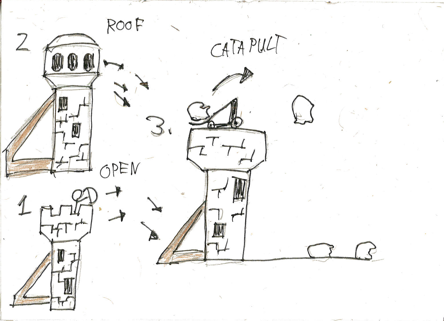
Figure 4 is the child design. A kid would have seen castles in Disney films and cartoon show, and what better way to show progression by making things bigger every time? It's a rather childlike mentality that overtook many of my designs and models later on.
![]() |
| Figure 5. |
![]() |
| Figure 6. |
![]() |
| Figure 7. |
![]() |
| Figure 8. |
![]() |
| Figure 9. |
![]() |
| Figure 10. |
Outside the Box Project Alpha Work - Concept Art - The Monsters
Whilst Josh was our core concept artist, the three of us on the team performed various roles of a game studio. For myself this mainly focused on additional artwork, coding and 3d modelling/UV unwrapping. I left final designs of the enemies of our game, The Monsters, and their child like forms to a collaboration between Josh and Chess. However I decided to add my variations of a few of the core Monsters, including my own original Monster design.
(^ The Sneak ^)
The Sneak was the first concept I made digitally.
For all of these digital Monster's I used varying percentages of grey to add layers and tone to the faces of the characters. In this list of digital art I have presented them in chronological order from those I made first to those I made last, with The Sneak first and The Necromancer last.
I believe that The Sneak came out better than The Spy in it's shape and blend of tones
(^ The Spy ^)
I feel as though The Spy was the weakest variant I created, whilst I'm sort of happy with it I feel as though the depth was not as well implemented on The Spy than with the other Monsters, Especially the hair, it was my first attempt in this line of digital work to make hair and I feel as though it didn't come out all that well, however pieced together, I feel as though The Spy is still an alright creation from me.
(^ The Monarch ^)
I believe The Monarch to be one of the best of The Monster concepts I made, after painting her, I felt as though I got back into some of my stride that was lacking with The Sneak and Spy.
I like the smoothness and regal like qualities of the paint work, I liked the idea of the adapting the size of the horns denoting rank concept to The Monarch, not having the largest, but instead having a crown of horns, which gives her, her status.
(^ The Hunter ^)
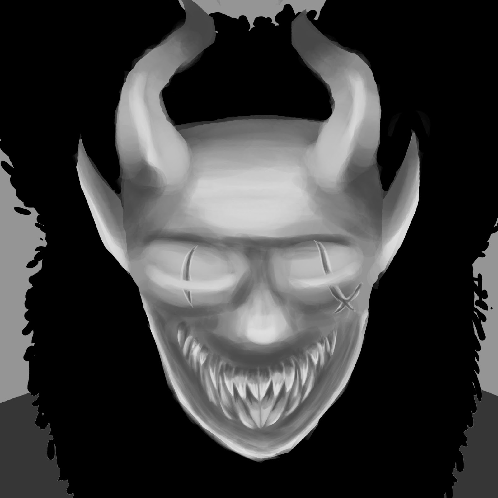
Again, like The Monarch, I consider The Hunter to be one of the more successful concepts I made for this project and thoroughly enjoyed making the concept. my goal was to change the view of the face, to see it more from a top down perspective, so as to make The Hunter appear more menacing in the concept as he is meant to be the main antagonist of The Monsters and our game.
I feel as though I achieved this goal of menacing rather well, especially though the teeth, giving him an eerie smile, one that isn't trustworthy.
(^ The Necromancer ^)
Outside the Box Project Alpha Work - Documentation (One Sheet etc.)
To start, the documentation side of the role of Game Designer was split between myself and Chess, they took on the Game Design Document whereas I pieced together the One Sheet.
The initial idea was to have the one sheet represent the view of the table within the main menu, however, after creating the initial one sheet it came across as too informative. One Sheet's are designed to be snappy and to the point with information. That, plus Chess came up with a standard for all our documentation that would include a cardboard background to all official documents and images would be "pinned" up on the documents, to keep the aesthetic of our game ever-present.
This is our One Sheet as of our first presentation milestone, which we showcased to the class, guest Steve Goss and out tutors.
Wednesday, 27 April 2016
Final Render/Piece Paint-over
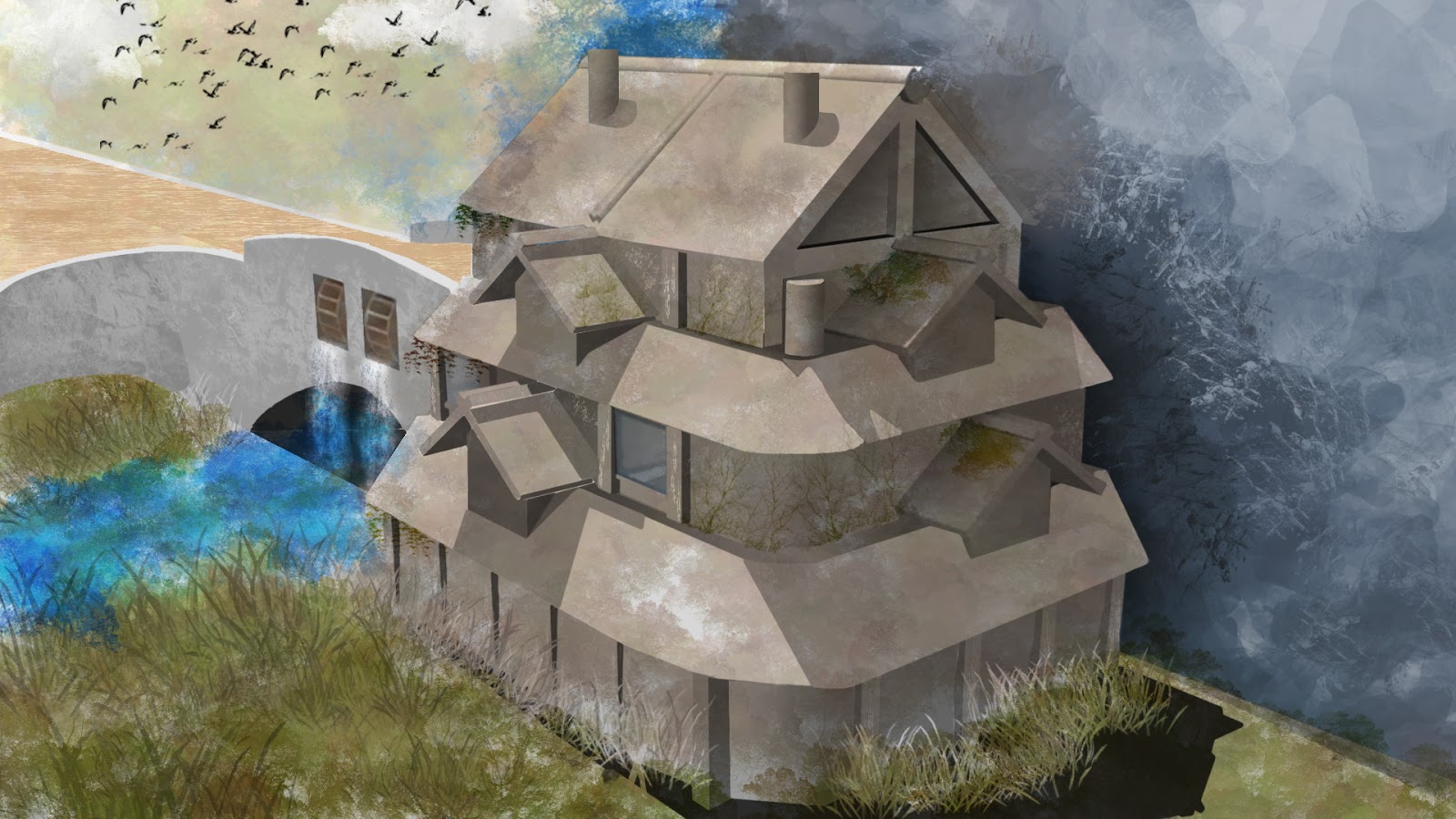
For my final piece I made another render of my model in Maya using Mental Ray in a perspective I haven't really represented in most of my work for this project.
I made the building the focal point of the render and moved the saved JPG file to Photoshop.
Within Photoshop I didn't just take the image and make it Black and White, I felt that would be cheating. Instead I used my experience making the thumbnails for this project to use the different percentage swatches of the grey scale available in Photoshop to paint over the image using Normal layers, eyeing up the shades of grey I saw and remembering knowledge from my 1st year at university, mainly that all shadows are at 50% on the grey scale so I made the main shadow of the building 50%.
I also used a texture brush to add detail to my right hand side background. This is where the waterfall cliff face followed on.
I mainly made use of the gradient tool and the basic hard edge brush to create the complete grey scale version of the piece.
Upon completing the grey scale version I two things left to decided on; first was the overall tone of the image when I began to apply colour, second was how I was going to make the left hand side background interesting.
With some advice I added the idea of a brick path along the bridge leading to the front door. At first I figured I would just extend the bridge/path to the edge of the canvas but then I decided that I would curve the path around off canvas, as if the path from the bottom left corner of the canvas led up from a hill and connected/curved into the path leading to the front door of the mill.
As I began to apply colour to the scene I began with the ground. I already knew that I wanted there to be healthy overgrown grass at the base of the mill, thanks to its proximity to the waterfall. As I added grass to the ground I enjoyed the idea that the grass is overgrown not just because of its proximity to the waterfall but also because the mill has long been abandoned.
I loved the idea that the mill has been sat here for some time but the water still flows through the mill wheels in the bridge, turning the cogs inside and raising the trip-hammers inside. I liked the character it gave this building as the hammers would continue to rise and crash down without reason.
To emphasise this I decided to paint the mill as though it were rotting somewhat and that it had grown mouldy due to the proximity to the waterfall without human care.
To add to the idea of the hammers still working I added birds flying off into the distance, as though they had just been disturbed by the crash of one of the hammers falling once again.
I then came back to the piece after some time and gave it a look over. I really like how this has turned out and I had a thought to improve it, as the water from the waterfall would hydrate the area frequently I decided to paint moss and leaves and vines growing on the mill itself to add some more character and make the narrative of the scene easier to spot.
I definitely think this has been one of my best 2D artistic creations, especially considering I am not to confident with colour yet, however I am finding that painting in grey scale has helped improve my eye for tone immensely and has improved the overall quality of my final piece when I came to paint the scene.
For improvement I would go over the mill design once more and I would change a couple of things. Firstly I would make the design symmetrical, right now the design has the mill pressed against the waterfall cliff face which I thinks works contextually; however human design is typically symmetrical as standard.
Secondly I would adjust the overall structure so that it was so neat, modern era architecture is mostly neat, however contextually this mill has been built around the 14th century and I think it would add character to the design had the walls been a little more curved. I had included the curved walls somewhat but they are hard to see as they are only noticeable at the base in the shadows of the wooden supports.
Thirdly I would overhaul the design of the irrigation system of the mill, I think it would function but it's not terribly well conceived.
A last minute addition I made to my final piece was that of a palette swap on the roofs of the mill, I feel this better implies the thatched materials of the roofs with colours swinging towards yellows, browns and greens. I also feel the change helps set the narrative of this dilapidated mill with the thatched roofs growing mould in the moist environment of the waterfall.
Model Sheet
As part of the concept art project we were tasked with producing a model sheet of whatever we were designing so that it could be taken into a 3D modelling program and a 3D model could be made, textured and used in game.
For characters this would take up the form of a T pose model sheet with the front, back and side views of the character present.
For an environment piece this would take the form of a birds-eye view map.
For a building design such as mine it would take the form sort of like a character T pose, in that a front, back and side view needed to be represented but also and plan (top down) view also needed to be present.
We were also told within our brief's that the model sheet required annotation to inform of the models characteristics and the materials used in its production; such as clothing material or the material used to create a bridge.
For my model sheet, as it is a model sheet for a building, I decided to make it in the form of a blueprint.
I also added shadows to the line art for better perception of how light reacts to the model.
Subscribe to:
Posts (Atom)