Wednesday 27 April 2016

Final Render/Piece Paint-over


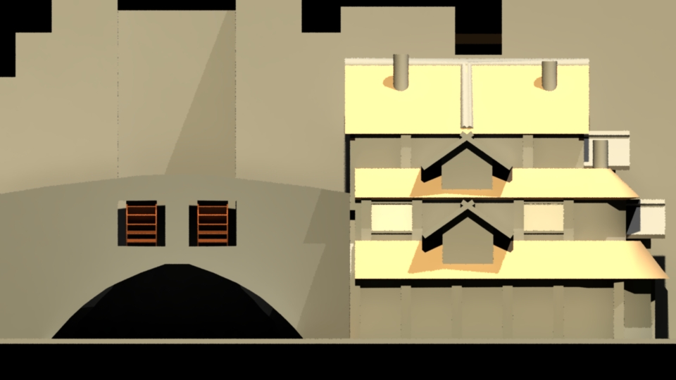
For my final piece I made another render of my model in Maya using Mental Ray in a perspective I haven't really represented in most of my work for this project.
I made the building the focal point of the render and moved the saved JPG file to Photoshop.


Within Photoshop I didn't just take the image and make it Black and White, I felt that would be cheating. Instead I used my experience making the thumbnails for this project to use the different percentage swatches of the grey scale available in Photoshop to paint over the image using Normal layers, eyeing up the shades of grey I saw and remembering knowledge from my 1st year at university, mainly that all shadows are at 50% on the grey scale so I made the main shadow of the building 50%.
I also used a texture brush to add detail to my right hand side background. This is where the waterfall cliff face followed on.
I mainly made use of the gradient tool and the basic hard edge brush to create the complete grey scale version of the piece.


Upon completing the grey scale version I two things left to decided on; first was the overall tone of the image when I began to apply colour, second was how I was going to make the left hand side background interesting.
With some advice I added the idea of a brick path along the bridge leading to the front door. At first I figured I would just extend the bridge/path to the edge of the canvas but then I decided that I would curve the path around off canvas, as if the path from the bottom left corner of the canvas led up from a hill and connected/curved into the path leading to the front door of the mill.
As I began to apply colour to the scene I began with the ground. I already knew that I wanted there to be healthy overgrown grass at the base of the mill, thanks to its proximity to the waterfall. As I added grass to the ground I enjoyed the idea that the grass is overgrown not just because of its proximity to the waterfall but also because the mill has long been abandoned. 
I loved the idea that the mill has been sat here for some time but the water still flows through the mill wheels in the bridge, turning the cogs inside and raising the trip-hammers inside. I liked the character it gave this building as the hammers would continue to rise and crash down without reason.
To emphasise this I decided to paint the mill as though it were rotting somewhat and that it had grown mouldy due to the proximity to the waterfall without human care.
To add to the idea of the hammers still working I added birds flying off into the distance, as though they had just been disturbed by the crash of one of the hammers falling once again.

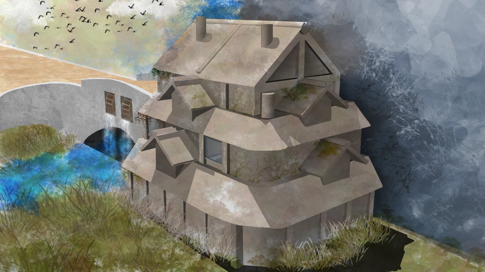
I then came back to the piece after some time and gave it a look over. I really like how this has turned out and I had a thought to improve it, as the water from the waterfall would hydrate the area frequently I decided to paint moss and leaves and vines growing on the mill itself to add some more character and make the narrative of the scene easier to spot.
I definitely think this has been one of my best 2D artistic creations, especially considering I am not to confident with colour yet, however I am finding that painting in grey scale has helped improve my eye for tone immensely and has improved the overall quality of my final piece when I came to paint the scene.

For improvement I would go over the mill design once more and I would change a couple of things. Firstly I would make the design symmetrical, right now the design has the mill pressed against the waterfall cliff face which I thinks works contextually; however human design is typically symmetrical as standard.
Secondly I would adjust the overall structure so that it was so neat, modern era architecture is mostly neat, however contextually this mill has been built around the 14th century and I think it would add character to the design had the walls been a little more curved. I had included the curved walls somewhat but they are hard to see as they are only noticeable at the base in the shadows of the wooden supports.
Thirdly I would overhaul the design of the irrigation system of the mill, I think it would function but it's not terribly well conceived.


A last minute addition I made to my final piece was that of a palette swap on the roofs of the mill, I feel this better implies the thatched materials of the roofs with colours swinging towards yellows, browns and greens. I also feel the change helps set the narrative of this dilapidated mill with the thatched roofs growing mould in the moist environment of the waterfall.

Model Sheet

As part of the concept art project we were tasked with producing a model sheet of whatever we were designing so that it could be taken into a 3D modelling program and a 3D model could be made, textured and used in game.
For characters this would take up the form of a T pose model sheet with the front, back and side views of the character present. 
For an environment piece this would take the form of a birds-eye view map.
For a building design such as mine it would take the form sort of like a character T pose, in that a front, back and side view needed to be represented but also and plan (top down) view also needed to be present.
We were also told within our brief's that the model sheet required annotation to inform of the models characteristics and the materials used in its production; such as clothing material or the material used to create a bridge.


For my model sheet, as it is a model sheet for a building, I decided to make it in the form of a blueprint.


I also added shadows to the line art for better perception of how light reacts to the model.

Photobash Water Mill

A technique used within the games industry among concept artists is the practise of Photo Bashing. This is the act of taking photographic images, placing them onto the photoshop canvas and editing them together to form the texture, basis, shape etc of the thing the concept artist is trying to create.
I decided to attempt to make a version, or even possibly my final piece using this practise, I used one of my renders of my model as a basis of the scene.


Below is how my attempt turned out, I kept putting it off as I was struggling to find all the appropriate parts for the photo bash and in the end I moved on to making a grey scale version of another render which would in turn go on to become my final piece with colour.

For what it is and considering I have never attempted to photo bash before this piece I feel as though it turned out well and that I was on the right track for making a half decent attempt at a photo bash.
I would certainly say that the ground with the river flowing from the bridge, the water falling from the mill wheels and the mill wheels themselves are the best past of the piece, I feel like they meshed together well and would only require a little editing to finish those piece off. I do like the addition of moss on the bridge however the bridge itself still requires work to fit with the ground and there is still a harsh cut off where it connects to the mill. The mill however is also completely unfinished but I feel was going in the right direction. Had this been finished I would have painted over parts to make it look more like an amalgamation of photo realistic textures and painted textures.


Modelling the Environment for Paintover

As time drew closer to making my final sketches as a final piece and model sheet I felt it would support my project to model my mill design from my thumbnails within Maya, once completed I would be able to use Mental Ray to render high resolution images of the model in perspective for paint over for both the final piece and model sheet.


Unlike if I had been modelling for a game project I had little concern over the topology and the flow of the model, my priority was to make the shape as quickly and accurately as possible. To that end I used simple poly primitives with little exits to make the overall shape of the building.
There were a few poly's that I worked into to create the model, these were the main structure of the building itself which is all one poly cube extruded and scaled over and over again to create the shape of the roofs and walls. I also worked into the wheels of the mill so that when I made a render of the model I would be able to see how the lighting reacted to the geometry of the wheel.


The above four renders were used for the construction of my model sheet, having the near perfect line ups in all four views that I needed for my model sheet made making my model sheet all the more easier and time efficient.


These two renders were the perspectives I decided to work with for my final compositions. The above render I worked on first as I attempted make my final piece by using a technique known as photo bashing, its a common technique used frequently among concept artists as it allows shape and form to flow quickly to produce a piece that is both decent not time expensive.
The photo bash didn't work out in the end and so I began on a new render that I would paint over.


The above render was the one I decided to use for my final piece as I liked the composition of the render, it's a perspective I haven't really touched on throughout this project and I felt it would make my final piece all the more distinct.

Thumbnail Art

One of the requirements of this project was to make thumbnail sketches to practise form, tone and shape for influencing a design leading to the final design. Typically thumbnail sketches are silhouettes of the thing they are trying to represent with some grey scale shading after the shape has taken form. I however decided to take time with my thumbnails and flesh them out into little pocket sketches of the some possible directions I could take my design.


I made this set of ten thumbnails initially. Making each one step by step using the percentile grey scale swatches in Photoshop, typically with the lightest value being 20% and the darkest being around 80%, I began to appreciate and understand how light reacts to an object, like a building, much more than I did before this exercise. 
I made these over the course of a few days and I think it shows as I placed a lot of effort not to just make these thumbnail sketches with basic shapes and/or silhouettes but to also add character to the scenes they represent; such as the more church like mill thumbnail 2nd from the bottom on the right I tried, and I feel like I succeeded, to make the scene feel ominous, with the imposing structure before you and lightning crashing down in the background.
I'm really pleased with how these turned out, I am particularly fond of the top 3 and indeed I enjoyed the design 2nd down on the left enough that I decided to carry it over to make my final piece.
To improve I feel as though there needs to be a greater contrast of shades in the grey's to make the structures themselves stand out more.


Afterward I was pleased enough with how my initial thumbnails turned out that I decided to expand and create a couple more. Again I do like how these turned out, they aren't as atmospheric as the initial eight I made however I do think they are interesting enough to sit alongside them.
For the top thumbnail I wanted to give this feeling of the mill itself being on a cliff face with little ground beneath and around it and requiring a bridge to access the mill. I also wanted to practise with a little graphic novel/Sin City art style by adding a singular colour to the scene among the grey scale, and I did this with the water spewing out from the wheel. I would say that the top thumbnail is one of the weaker designs and executions among my thumbnails however I do still think it came out ok.

For the bottom thumbnail I wanted this cabin in the woods feeling, similar to the the top left thumbnail of my initial thumbnails. The idea is the it's within a clearing within a forest and that the structure off to the left of the building has focused a channel or gully into a single stream to move the mill wheel, with the stream that it would have initially flowed into present.
This is one of my favourites of my thumbnails, I appreciate the simplicity of the design however it isn't too game like, or at least game like enough within its aesthetic for me to choose it over my other thumbnail designs; some of which have a Fable vibe to there style which I was going for in a few.

Water Mill research and development

As is part and parcel with concept art, to achieve a decent design one must draw inspiration and reference both from life and from other artists ideas. Below are my principal mood boards for my project, mood boards to draw inspiration from and to mash together to form my own ideas.


Below are my principal sketchbook studies inspired by my mood boards.


Further to this I began to draw from life, after class at university I would walk around town and draw the buildings I saw, as the architecture of the majority of the buildings around town matched what I wanted to achieve with my own design for my water mill.


I used some of these structural designs as a basis for a couple of my thumbnails when I progressed on to making them.

Tuesday 26 April 2016

Line art practise

It was suggested to me by my tutor, as a method of practise, to copy from already established environment work. I was directed specifically to an artist called Feng Zhu; Feng has his own blog upon which he posts the work of his students, it is from these students that I have chosen to observe and practise within the examples below.


The above practise sketch helped me to appreciate light and tone within a scene and assisted me later on when I went on to make my thumbnail sketches.


Sunday 24 April 2016

Lesson 02 - Light/Character practise


For this session we were tasked with copying and painting this robot from the example given as best we could within an hour/hour and a half. I believe this is a decent copy of the example as the only parts I failed to paint in was the gun and some minor detail on the torso. The anatomy is mostly correct to my eyes and I've included most of the important shade and highlights to represent the shape, you can look at this and understand what it is you are looking at.
I did have an issue around the half way mark as I noticed that the models legs were too short and so I corrected that by selecting them with the marquee tool and then adjusting the size of the selection.